
2025
The Logic of Univers
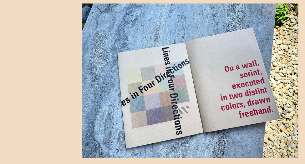
This project interprets Sol LeWitt’s conceptual and minimalist philosophy through typographic design. Using the typeface Univers, the book translates his logic, repetition, and structural discipline into visual form, emphasizing clarity, rhythm, and quiet precision.
Print & Collateral
Art Direction
Branding & Identity
Client /
School Project, School of Visual Arts
Inspired by Sol LeWitt, a pioneer of conceptual and minimalist art, this project explores how systems and ideas can shape visual form. The book’s French-folded format reflects LeWitt’s fascination with sequence, process, and layered meaning. Each page follows a calm, deliberate rhythm—echoing his structured, instruction-based approach to creation.
The chosen typeface, Univers, embodies LeWitt’s ethos of clarity and logic. Like his wall drawings, it operates within a precise framework yet allows for subtle poetry through repetition and variation. The design embraces restraint and rational beauty, allowing the concept itself to become the art.


